Filming a Micro-Budget Music Video - “no way i can sleep” by Julia Belle
BTS from the music video shoot
I directed the music video for Julia Belle’s debut single “no way i can sleep” which released on 13th August 2021. This was the second video we created for the competition we ran with Tiny Triumph Recordings, the first being the Shivers song ‘Runaway’. We spent a long time in pre-production for this video, working on and off on the project with the artist - and we were finally ready to shoot the video in July. In this blog post, Ben and I will show you our process of creating this music video, and how we did it using our own resources.
Planning & Changes
We both met with Julia in mid-February to figure out what her vision and vibe for the music video would be. While I had my own ideas after listening to the song, I didn’t want to completely take over and force my own vision onto someone else’s art - I still wanted to make something that felt authentic to who Julia is as an artist. After our first meeting, we got a good idea of what Julia liked and disliked. She wanted something that had a feeling of candidness, realism and nostalgia. We wanted to make something that felt planned and intentional, and this first meeting with Julia sparked an idea of mixing these aesthetics.
Over the next month we were sent quick ideas from Julia and video influences along with a Pinterest board of visuals. This was the perfect foundation for our treatment. In the past I have used mood boards to get an idea of the overall feeling of video. The references had a sense of filmic nostalgia associated with early home videos (Super 8) and disposable film photos. Our initial ideas were to load the video with summer nostalgia but as we moved further into winter, this quickly became an impossibility. This wasn’t a large hurdle, but we did have to rethink the scenarios we would shoot.
Julia’s Pinterest Board
Treatment
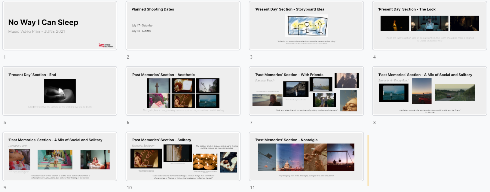
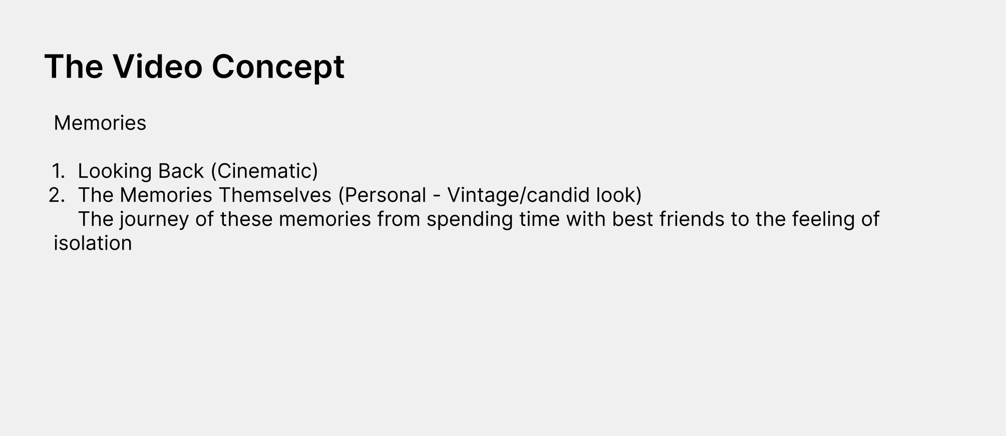
A few weeks out from our scheduled shoot dates, we created a treatment for Julia, to run over the visual ideas and structure of the video. The concept was quite simple - we have two timelines (past & present) with different aesthetics and intercut them. The intention was to show a simple story of slowly becoming more isolated. For various reasons this changed slightly in the edit, but I still tried to retain that feeling in the final export, which I will go into later.
We mainly worked off the ideas that Julia pitched for moments in the video. Aspects such as scenarios and important lyrics to build into the footage. Essentially, she was the “what” and we were the “how” in this project. We had freedom within these guidelines to make these ideas work. It was important to us that we made something that was authentic to Julia’s style and voice as an artist.
Final treatment document of “no way i can sleep”
Production & Resources
You don’t need high end gear to achieve the look of this music video. It’s not about what gear you have, it’s about how you use it (to quote every filmmaker).
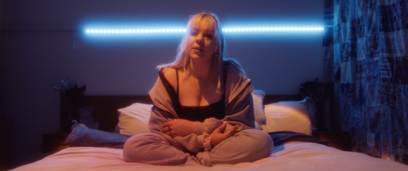
Shot 1: Bedroom Setup 1
Lighting Breakdown by Ben Stewart
I’ll be breaking down one of the locations we used for our latest music video – and how we lit it. We were chatting in the car afterwards about how this may have been the most low-cost setup we’ve done in terms of gear, yet that simplicity made it very effective on screen.
For this setup (Shot 1), we used one RGB strip light that the artist already had installed above her bed, one old YN300 bi-colour light (off in this first shot), and a sunset lamp bought from Aliexpress. These lights wouldn’t have cost more than $200NZD, but gave us a range of looks that I’ll talk about in this piece. This is the first shot from the video, and it features the sunset lamp lighting Julia from above, and the RGB strip set to blue. Neither of these would be considered cinema lights, but I really love the shape of the sunset lamp’s beam. Another thing that really tied the look together was the use of a mist filter – my one is a generic one that has a really extreme effect, but it really fit the nostalgic/dreamy vibe we went for in this video. This allowed the lights to bloom beautifully, and made our Blackmagic Pocket 6k feel much less digital. This was also aided by the use of FilmConvert – a colour grading software made right here in Wellington!
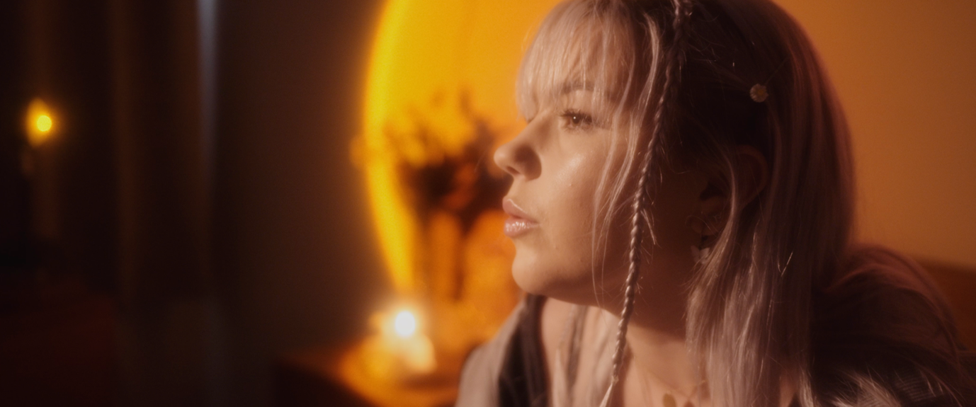
Here’s another shot (Shot 2) from the video which used the same location, but has a much different feel. This one is also very stylized, and features the sunset lamp as almost a projection over the back wall. This is very loosely motivated by the candle featured in the shot, although I wasn’t too concerned about the motivation in this one. We used the YN300 with a CTO Gel as a key light on the left, with a 5-in-1 reflector on the right side as a subtle bounce. The strip light also acts as a subtle hair/rim light. I think the mist filter allowed us to use harder sources of light than we would usually be able to get away with, and allowed us to get defined shadows while still lighting Julia in a flattering way.
Originally in this room, there was a panel heater on the wall on the right that looked awful. However we found a quilt which we managed to cover it with, and I think it adds some dimension/balance to the shot as well.
Here’s a closeup from the same setup:
Shot 2: Bedroom Setup 2
Shot 3: Bedroom Setup 2 (Alt. angle)
Shot 4: Bedroom Setup 3
Finally, this setup was similar to the first, except we put the sunset lamp on a light-stand and used it to both light Julia’s face and the background. This gave a real sunrise feel (surprise), and really draws your eye to Julia, then the background.
Adding onto Ben’s lighting/production breakdown, it’s important to know that this look can still be achieved on any type of gear. You don’t need to have a 6K camera or an expensive lens, this look could also be achieved with a phone camera and the same $20 mist filter from AliExpress. Use the resources you have and get creative with how you control whatever lights you have. The best way to work with very little is to learn to create an image with careful intention and over time these limitations won’t feel like limitations.
Shooting Home Videos
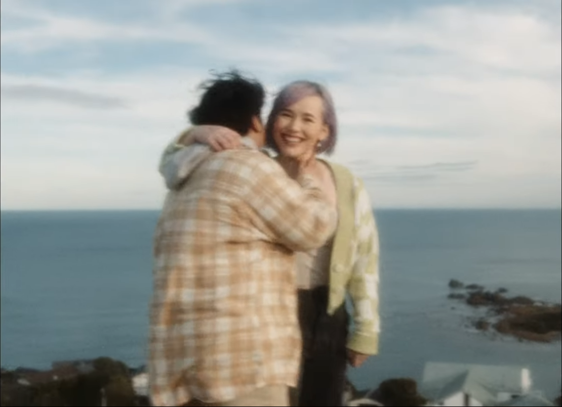
Shooting the home video style sequences felt more like a challenge in directing and immersion. While there wasn’t as much intent in our style of shooting as the present day bedroom sequences, we still went into the shoot with an idea of the style of how these shots would be put together. If you have a good idea of how the footage is going to be used you can plan and shoot for that style. Shooting 4:3 aspect ratio for these sequences was an intentional choice, a lot of my recorded childhood is in 4:3 and there’s a sense of nostalgia that comes with this aspect, and that is clearly evident in a lot of films and music videos today. They use 4:3 because it is so quick to illicit that feeling of nostalgia and memories. Using an ND filter was essential in these sequences, so that we could still maintain a 180° shutter angle even in the bright sun.
These sequences feel more run-and-gun and candid. I had a hand in shooting a few of these sequences and it felt like an exercise in immersing myself into the action as a director. I place myself as an active participant in what I film because that what home movies are, a record of memories from a subjective point of view. For the various sequences I would ask what Julia and her friends would want to do and figure out how to approach that. We had planned locations but I wanted to have the actions feel natural so I let them do whatever they felt comfortable and natural.
It’s quite refreshing to have that sense of freedom in shooting as we shot in natural light and we shot in a very observational documentary style.
Post-Production
Editing
‘no way i can sleep now’
One of my influences is Lithuanian-American filmmaker Jonas Mekas. I find his films extremely compelling and they all have a sense of nostalgia and freedom that I wanted to also illicit in this video. His films are jumpy, sped up and naturalistic. I’ve used that style in a few of my own personal projects and this was another project where I could play around with that style. The shakiness of the ‘past’ sequences didn’t detract from the video itself, instead it was by design. There’s a sense of pace that I create when I quickly intercut frames and jump cut within shots with film burns that just feels intuitive and natural.
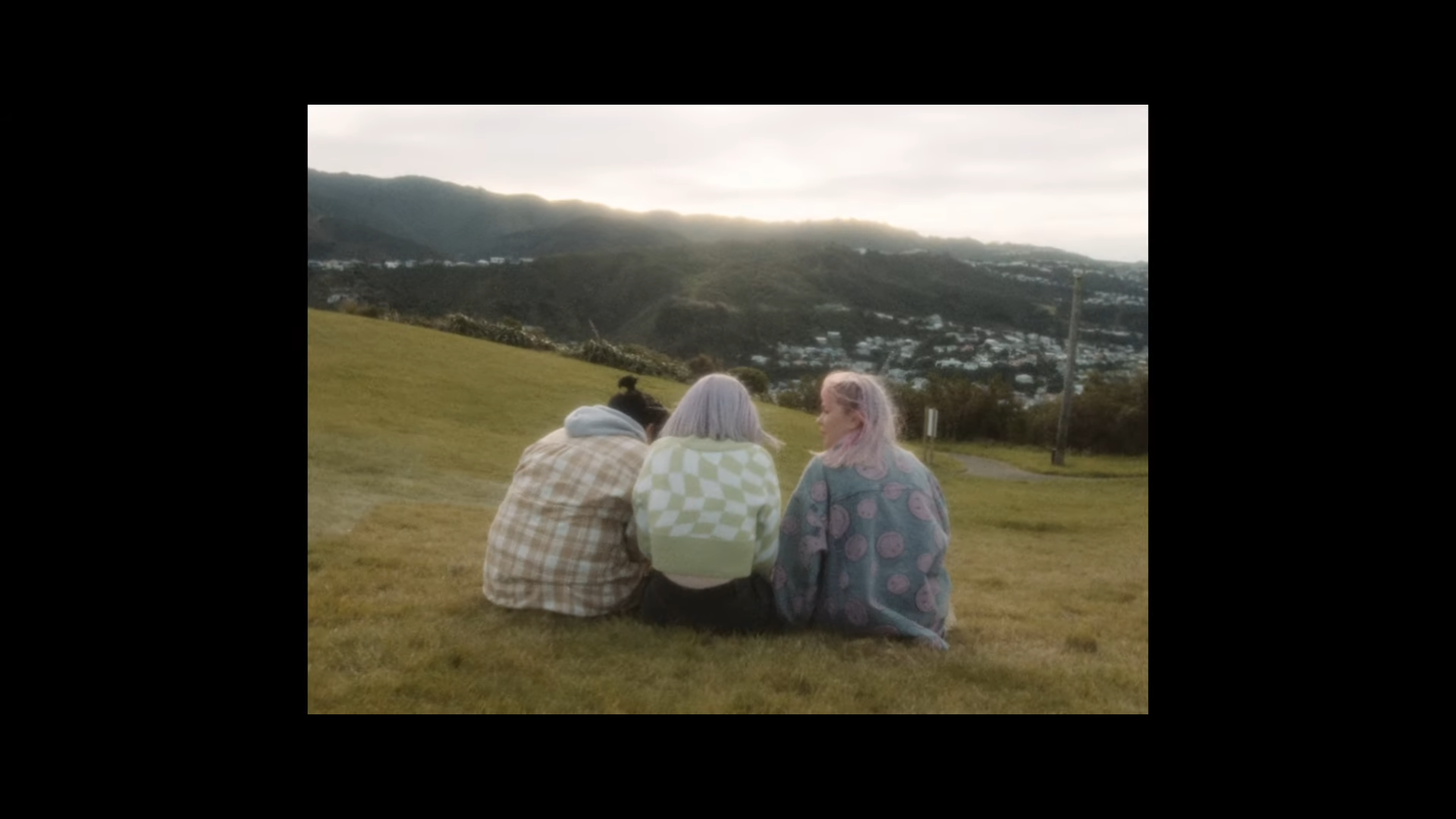
My original structure we pitched was changed slightly when we got to the edit, because of the footage we had captured. Instead I tried to cut sequences based on how they felt and what I thought they ‘said’ about that section of the song. At the end there is a small section of 4:3 that starts with Julia writing on the mirror followed by two shots of her sisters and her friends with backs faced to the camera. I was torn about this small sequence for a while, trying to figure out whether it should stay or go. In the end I made the decision to keep it in because I felt like it portrayed that sense of bittersweet so well, even if it isn’t literally solitary, there’s a sense of finality in the back facing shots that feel isolating to me.
This was an interesting challenge for us to tackle. We are really happy with how the final video turned out, and we’d like to thank FilmConvert and Julia Belle for their support with the video. I would like to thank Julia for the amazing song, Julia’s sisters Bianca and Deana for appearing in the video and helping us out, Rosabelle and Talyjah for also taking the time to be in the video. Also, a big shoutout is due to Toby Lloyd at Tiny Triumph Recordings for producing this track.


